Artifact, a Portland-based clothing boutique, hosts an annual holiday pop-up event. In 2019 they partnered with Joop Joop Creative and tasked Joop Joop with developing the branding and social marketing for that year’s event. While working with Joop Joop Creative, I had the opportunity to help design the primary branding elements and social collateral for this project.
My Role—
Art Director
Designer
Social Media Collateral
Art Director
Designer
Social Media Collateral
Social Media Assets
I started this project by researching the brand’s existing look and tone. Through this research, I was able to better understand the established style that Artifact expresses in both the digital and physical space.
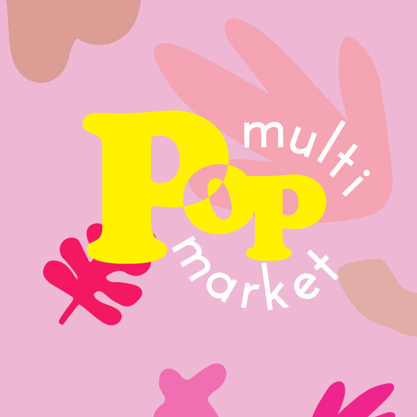
My primary objective was to design branded elements that used generic shapes that felt soft but playful and aligned with the existing brand’s aesthetic. Working closely with Fran, Joop Joop Creative’s owner, I designed a series of logo options that combined energetic typography, whimsical forms and fun pops of color.
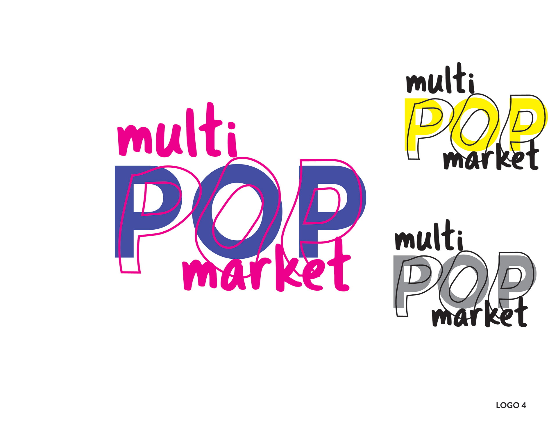
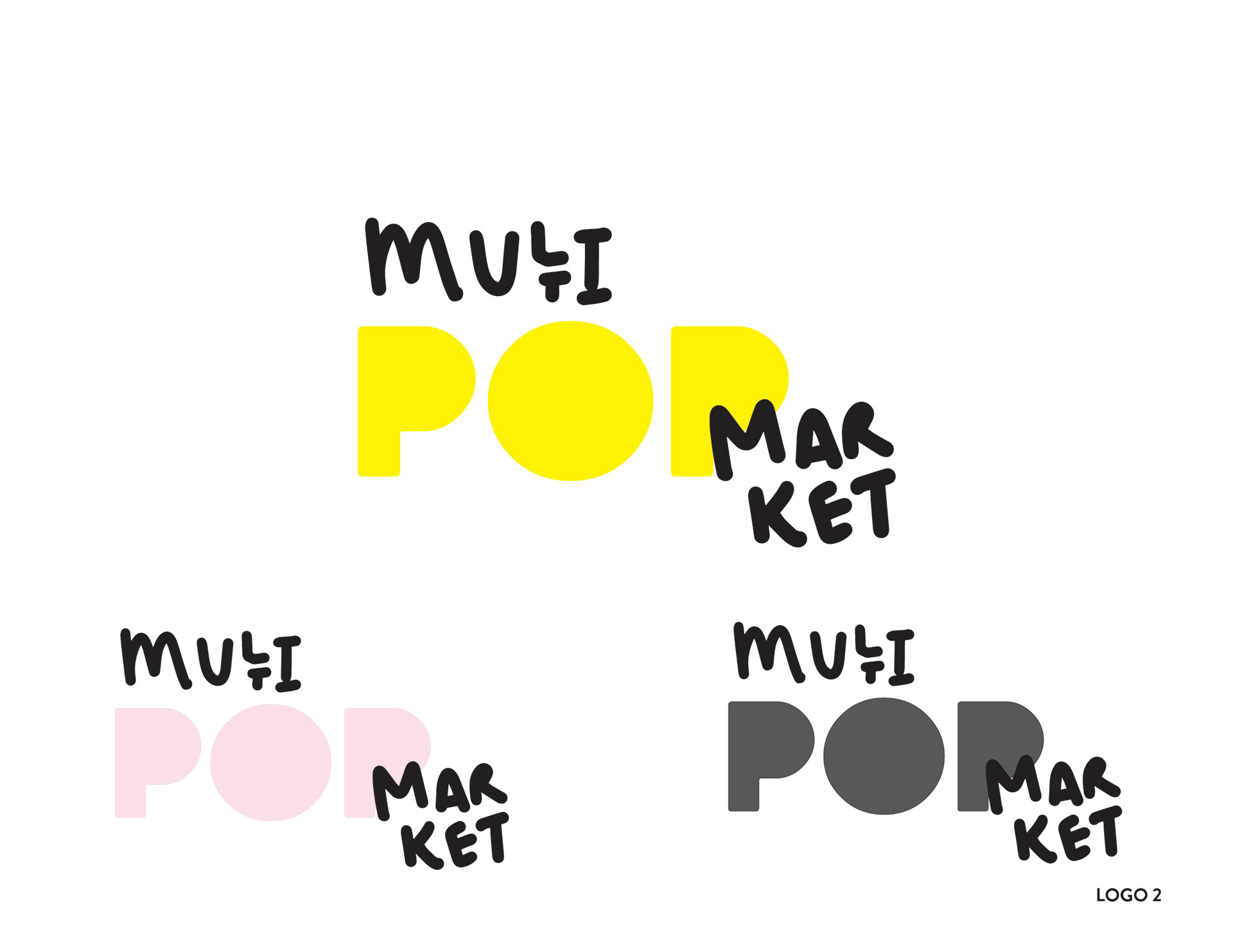
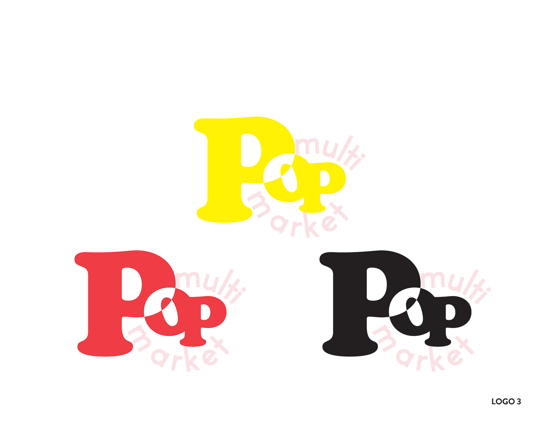
During the first phase of designs, I received feedback that the direction they were looking for was Logo 3 but it needed an emphasis on the word 'pop' while also making sure that the branding would match modern elements with mid-century style that Artifact has brought to life at their location and 1970's aesthetics.
Logo Exploration
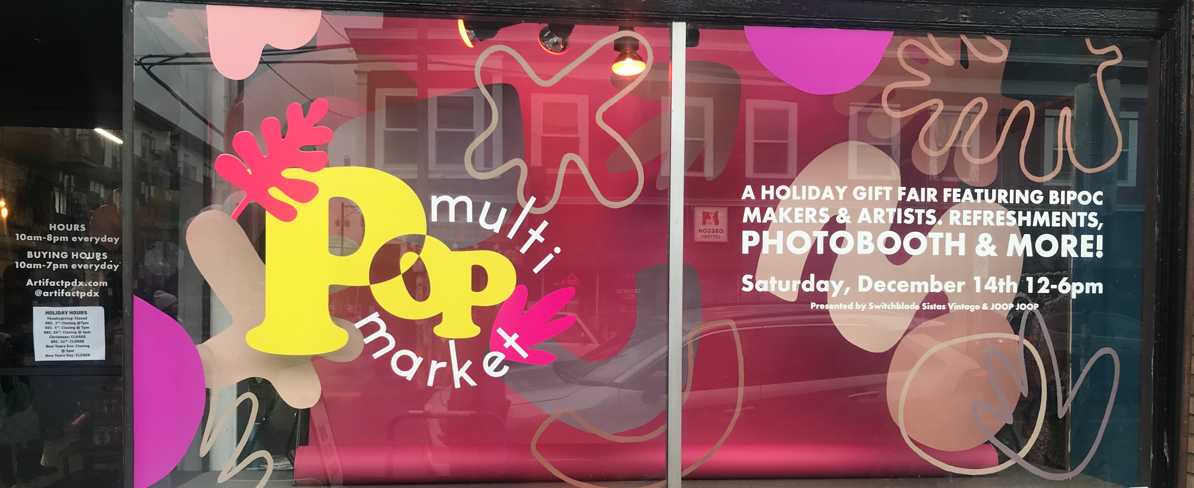
Window Decal


